Make payment operations legible.
One modular portal for sales, reconciliation, risk, onboarding and reporting.
Portal · Data · Onboarding · Reconciliation
Explore ↓01 / Product craft
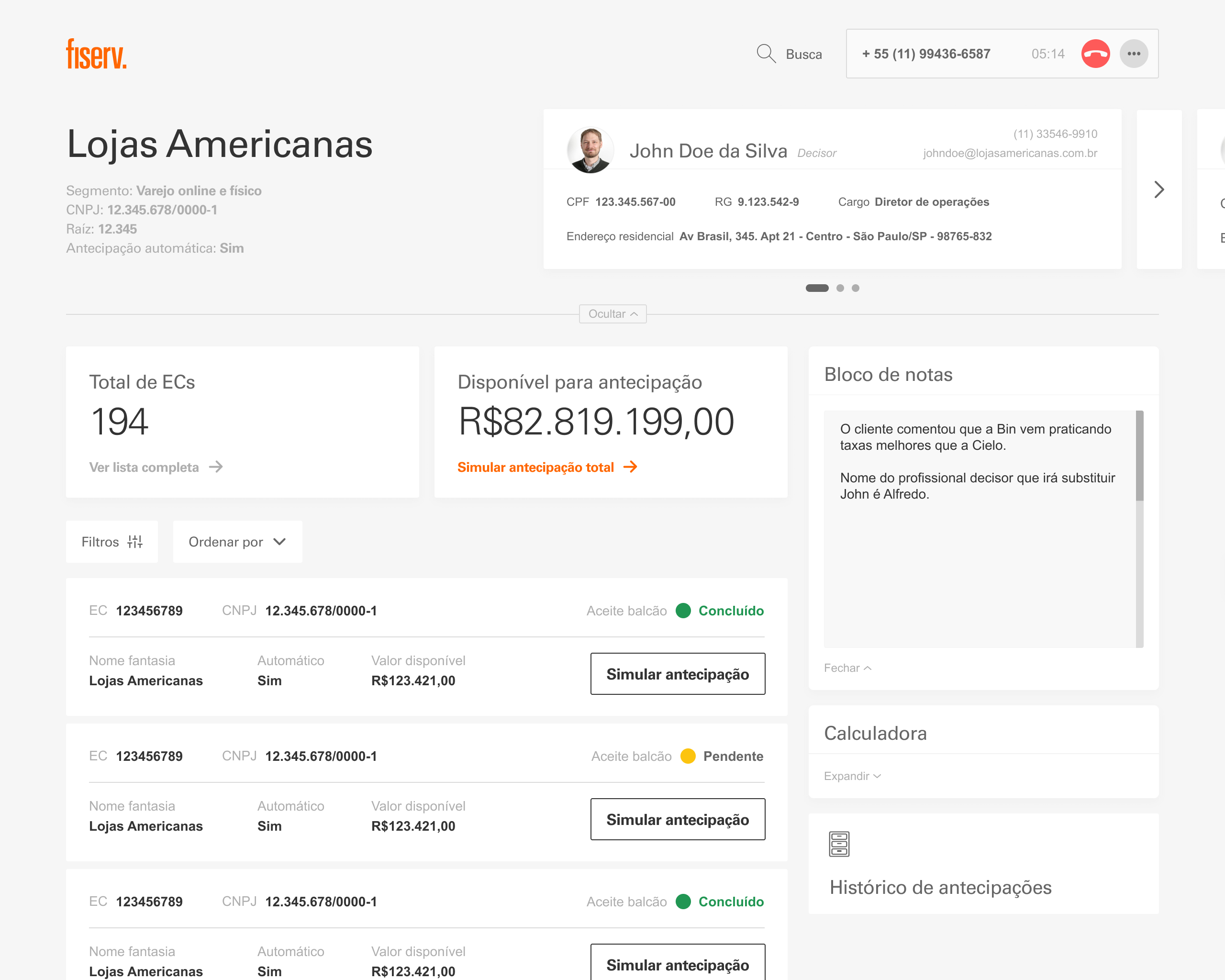
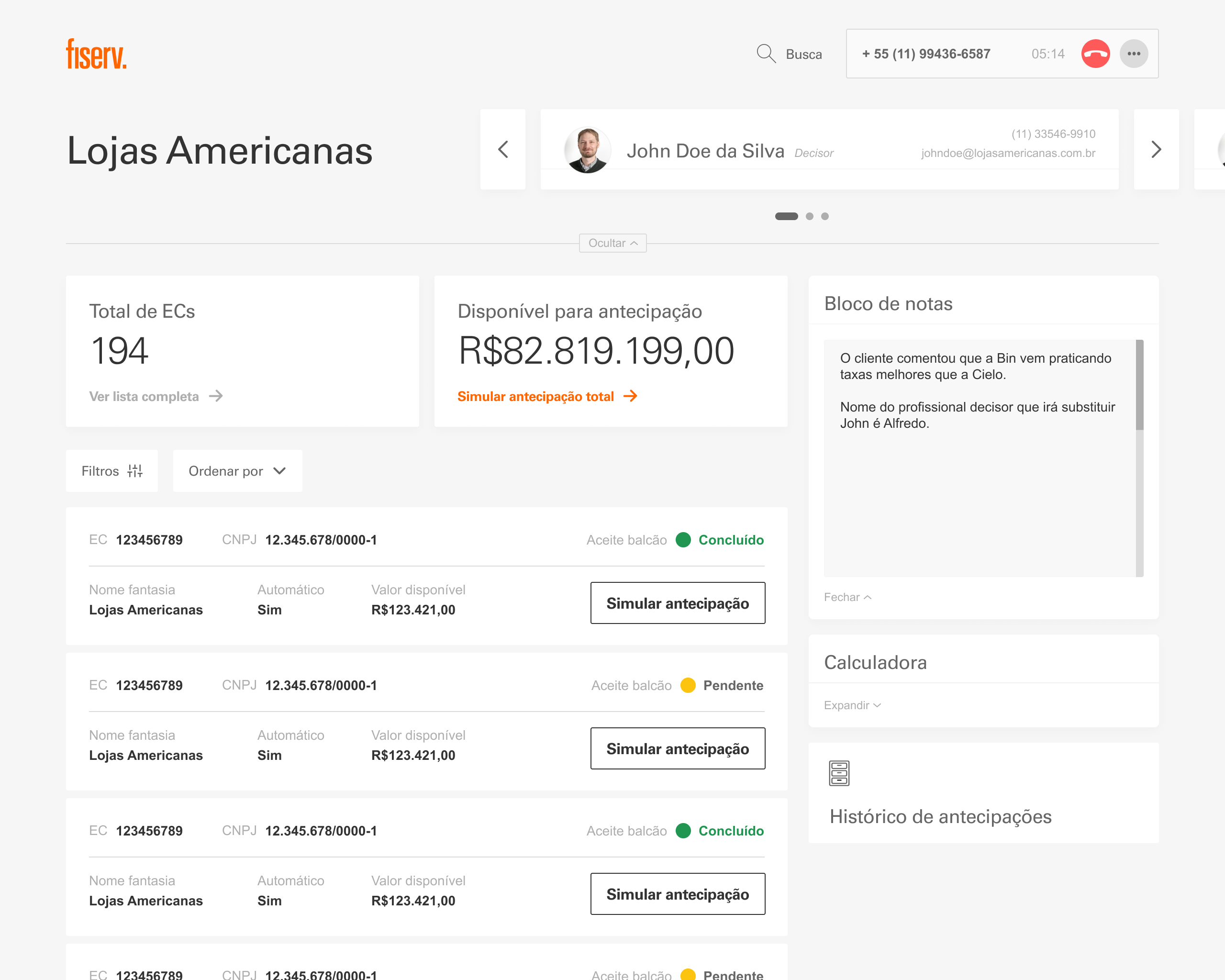
Design the decision surface around the work.
The operator concept brought customer context, available receivables, notes and simulation into one high-fidelity workspace. It is shown as a concept direction, not as shipped production.
02 / Context
A portal spanning the payment operation.
Carat needed to serve merchants and partners across sales, reconciliation, antifraud, settings and a growing product hub. The challenge was a fragmented payment ecosystem, with separate portals and no integrated view of the business.
As senior designer across the payments portfolio, I contributed directly to Gateway and Financial Management through information architecture, product flows, high-fidelity interface design, research direction and a reusable component foundation.
- ProblemFragmented portals · No integrated business view
- My roleSenior Designer · Direct product contribution
- CollaborationProduct · Design · Technology · Business
- StatusCarat production portal · 34 documented components
03 / Production context
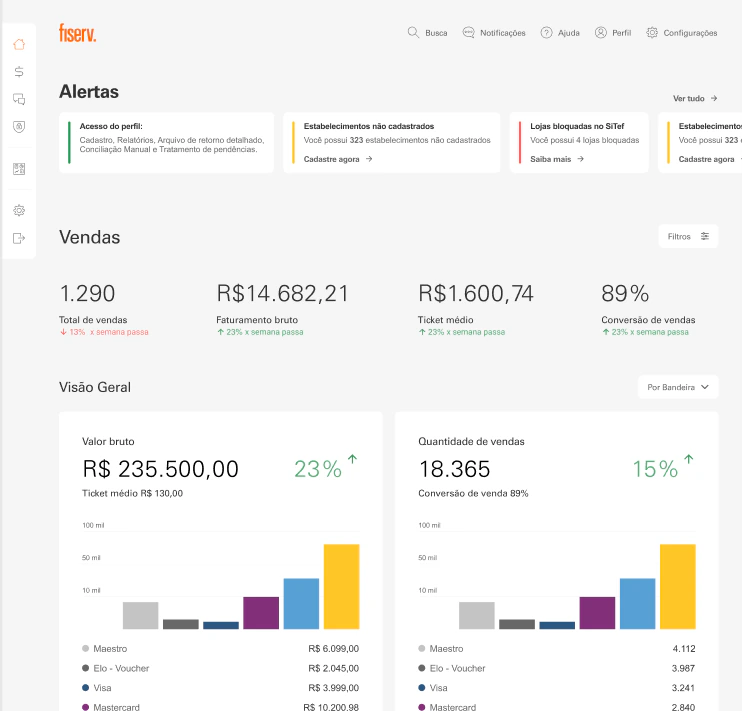
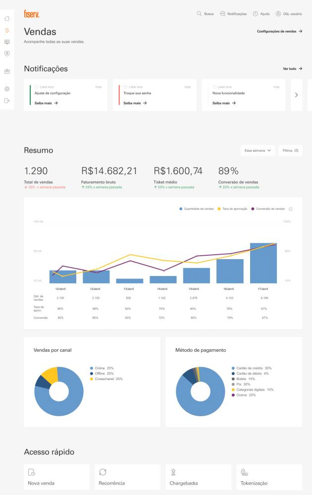
Real operations set the bar for clarity.
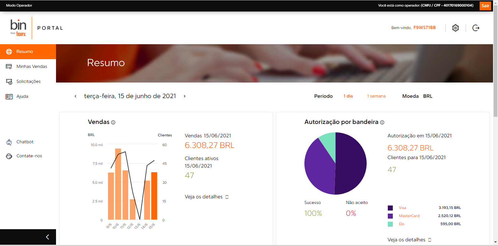
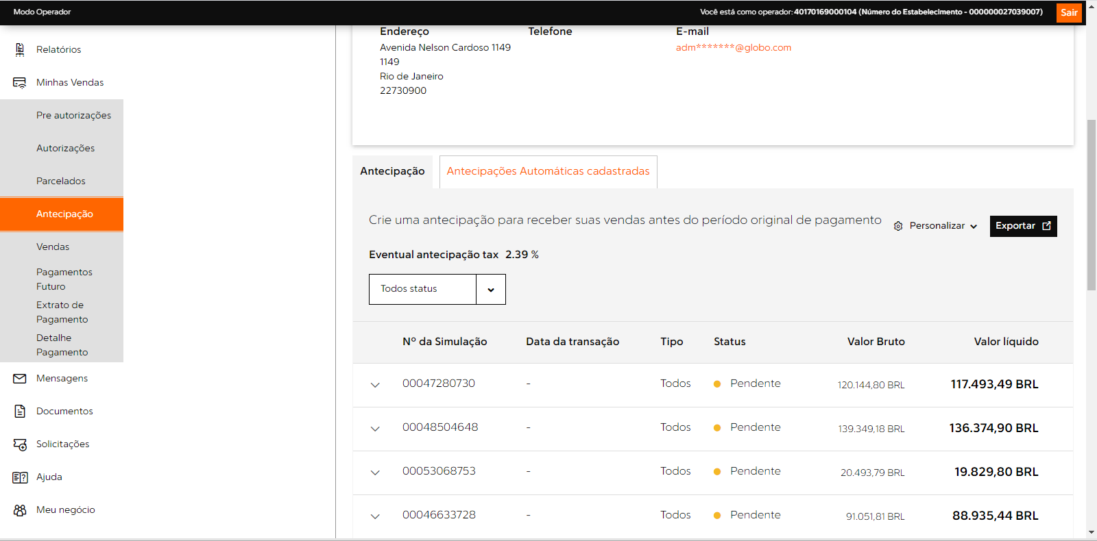
The live merchant portal exposed the density of sales and anticipation work. These screens are production references used to understand the operation, not the redesigned Carat interface.
04 / Interface system
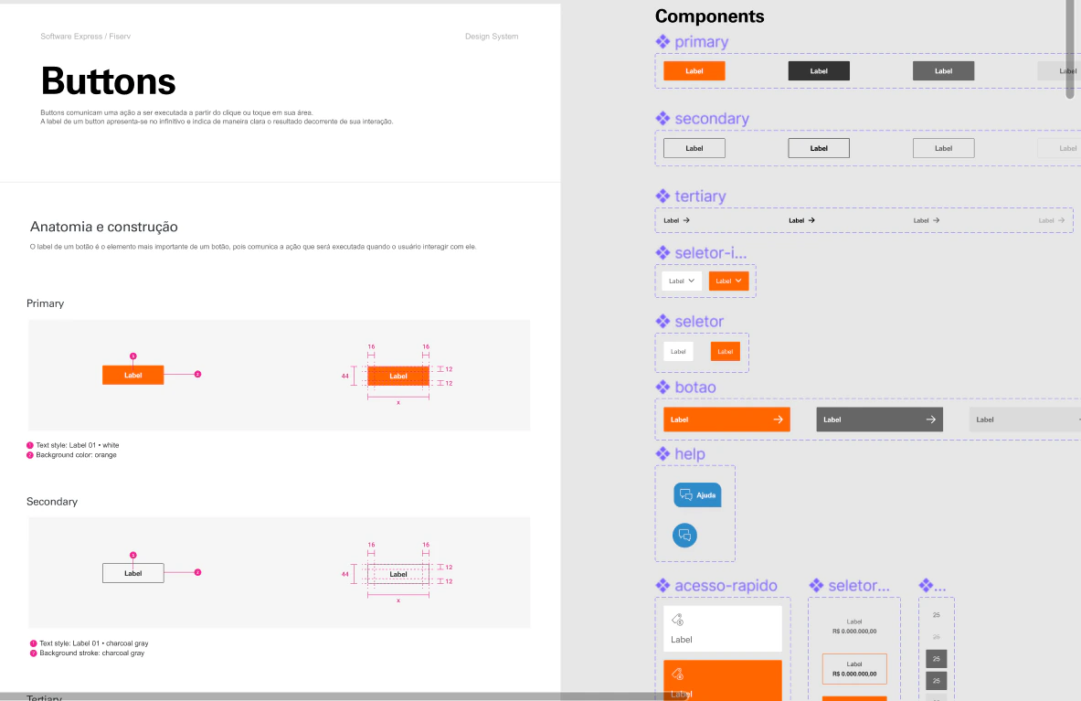
A system for data-dense decisions.
Hierarchy, color and components were tuned for scanning first, then examining the underlying operation.

05 / Product architecture
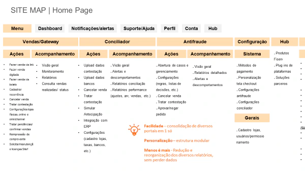
Modular without becoming fragmented.
The navigation connected action and monitoring within each business domain.
Sales, reconciliation and antifraud shared a predictable structure, while profile, accounts, configuration and the product hub stayed accessible without flattening their different jobs.
06 / Partner onboarding
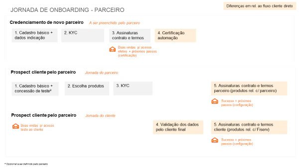
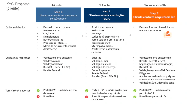
Separate responsibilities. Keep one journey.
Partner and client tasks were staged as one connected onboarding model.
07 / Operational depth
Reconciliation as a product surface, not a spreadsheet.
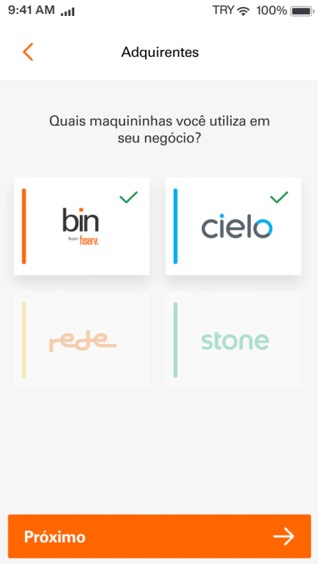
The same system brought channel, acquirer and cancellation data into a readable mobile view.
08 / Refinement
Small adjustments made dense data easier to use.
Usability sessions confirmed the direction and exposed specific clarity issues.
- Add explanation where KPI meaning was not self-evident.
- Move filtering closer to the content it changes.
- Resize screens and data blocks to preserve hierarchy across viewports.
Next case
Estratégia Cast · EdTech View ↘