design delivery capacity.
01 / Riachuelo + Midway / Design SystemFintech + retail · Design leadership
Two brands. One design system.

A shared foundation built to scale financial products and retail without flattening either identity.
Explore ↓00 / Context
Shared infrastructure. Separate product systems.
Riachuelo and Midway shared engineering and leadership, but their libraries and sources of truth had evolved separately.
Investments made for one brand rarely benefited the other. Duplicate components, inconsistent handoffs and repeated development work slowed delivery across financial products, retail and e-commerce.
I defined the system architecture, brand principles and governance model, then directed delivery across internal Design and Engineering teams and partner Try.
- ProblemDuplicate systems across two brands
- My roleDesign leadership · Architecture · Governance
- Key decisionShared foundation · Brand-specific expression
- Evidence+30% design capacity · -50% frontend implementation time
- 15squads
- 11direct reports
- 2brands
- 30M+customers
01 / Operating model
Make the system fundable before making it scalable.
UX operated without a dedicated budget. I created Midway’s first UX cost center for tools, headcount and the design system, while leading 11 designers across 15 squads.
When wallets and lending expanded the roadmap without additional headcount, I mapped team capacity, compared internal and partner delivery at present value and ran an RFP with five suppliers. Try was selected for its financial-sector experience and embedded delivery model.
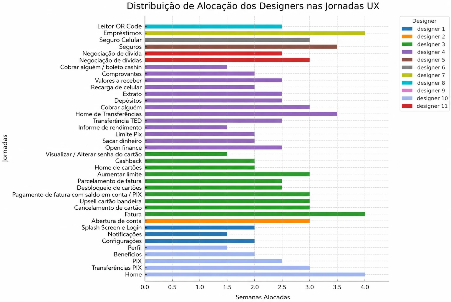
Case-reported operational results
One foundation. More capacity.
frontend implementation time.
freed from the UX cost center and reallocated.
02 / System architecture
From duplicate libraries to a shared system view.
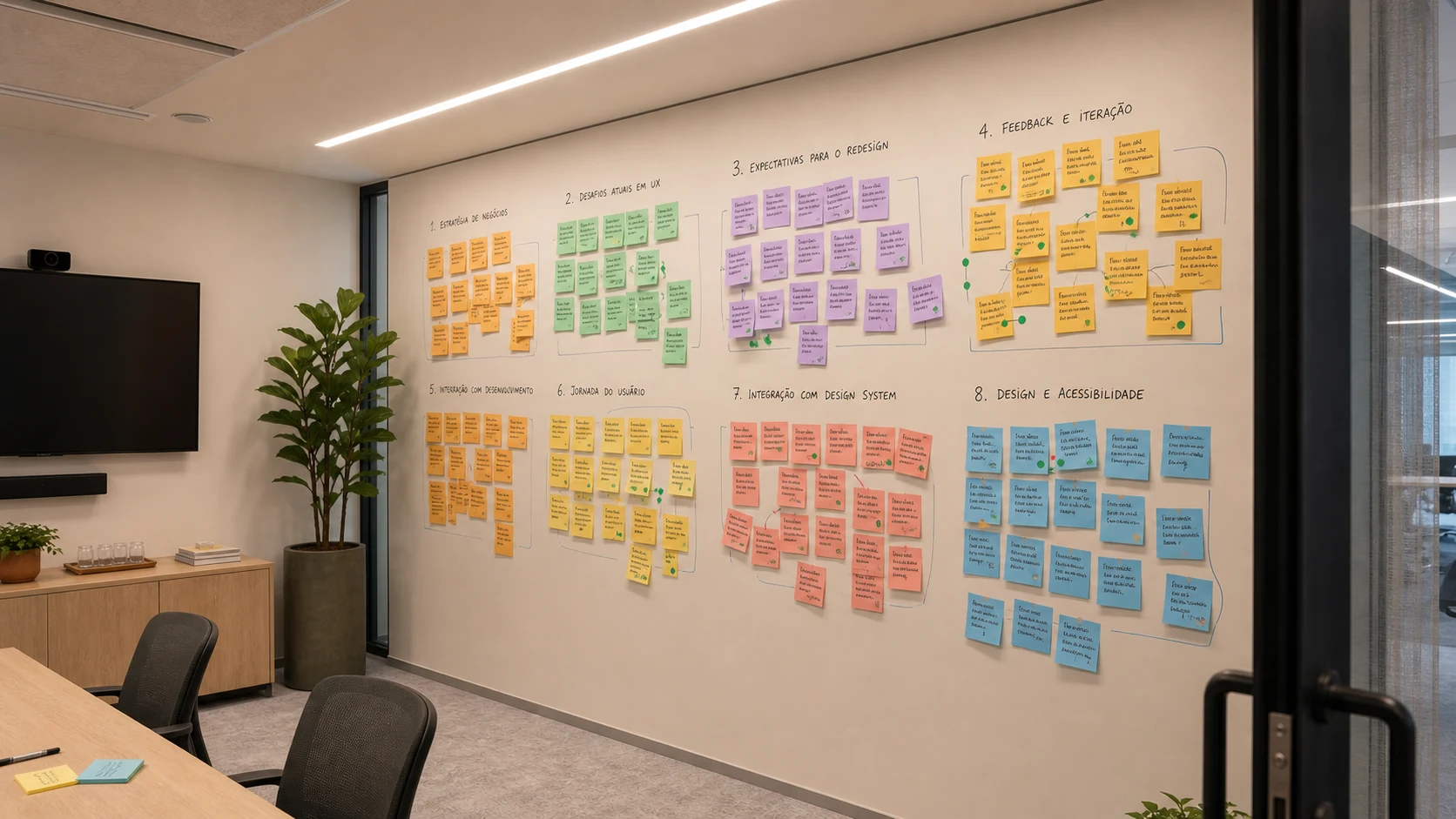
A workshop with the UX team exposed duplicated components and dependencies across Midway and Riachuelo.
We inventoried 98 essential components and classified each as shared, visually adapted or tokenized.
Identity
Disconnected typography, icons and color across both brands.
Interface
Different experiences for actions that should feel related.
Components
Inconsistent standards, documentation and handoff.
Universal design
Missing standards for accessibility, motion and feedback.
03 / Brand model
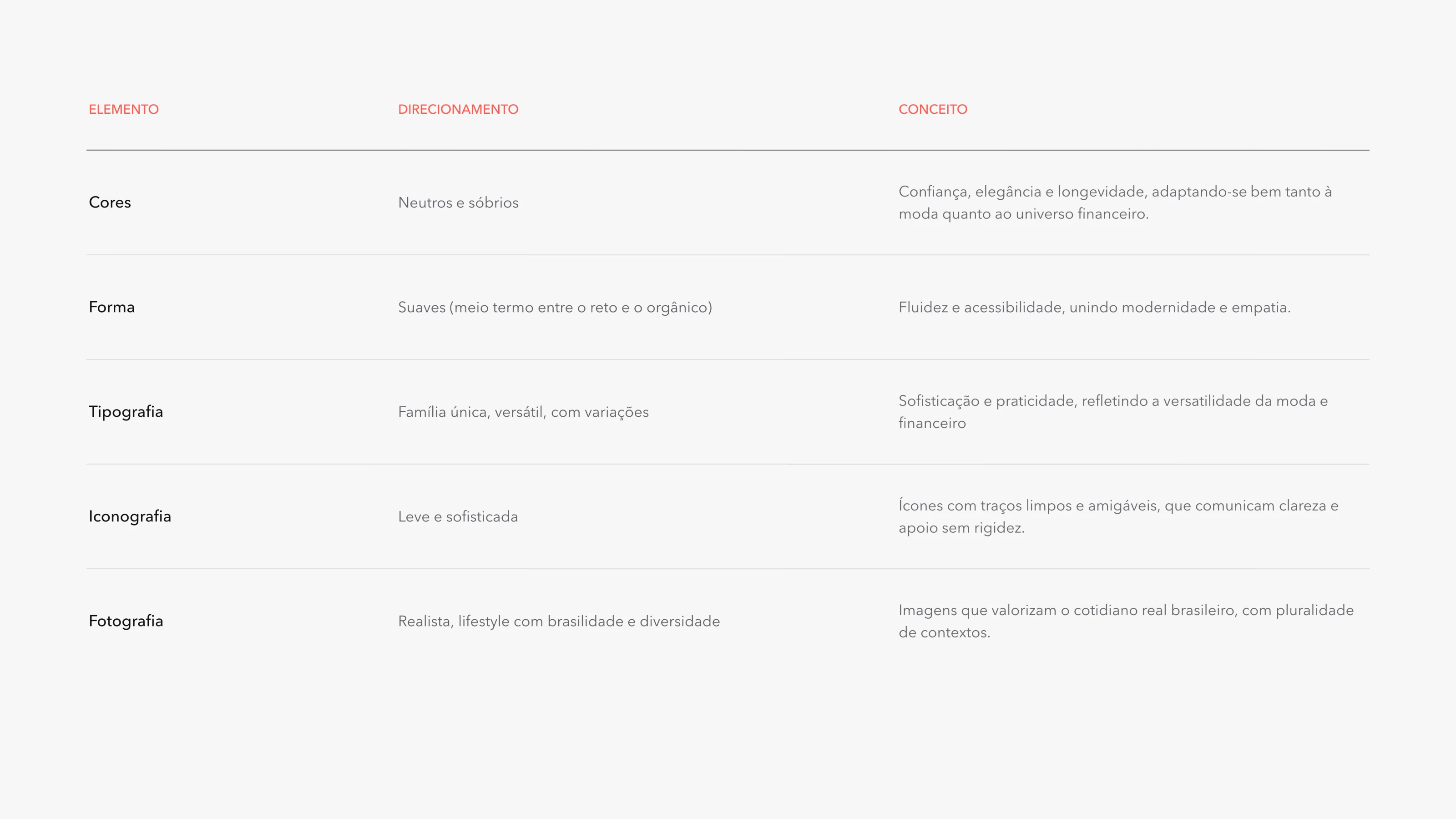
Share structure. Preserve expression.
A common system did not mean making a bank and a retailer look identical.
Research separated the problem into two workstreams: how connected brands create continuity, and how visual systems stay flexible without losing structural consistency.
- One component foundation across Midway, Riachuelo and E-commerce.
- Brand distinction through tokens, assets and controlled variation.
- Motion as product feedback for action, confirmation and attention.
Direction evidence
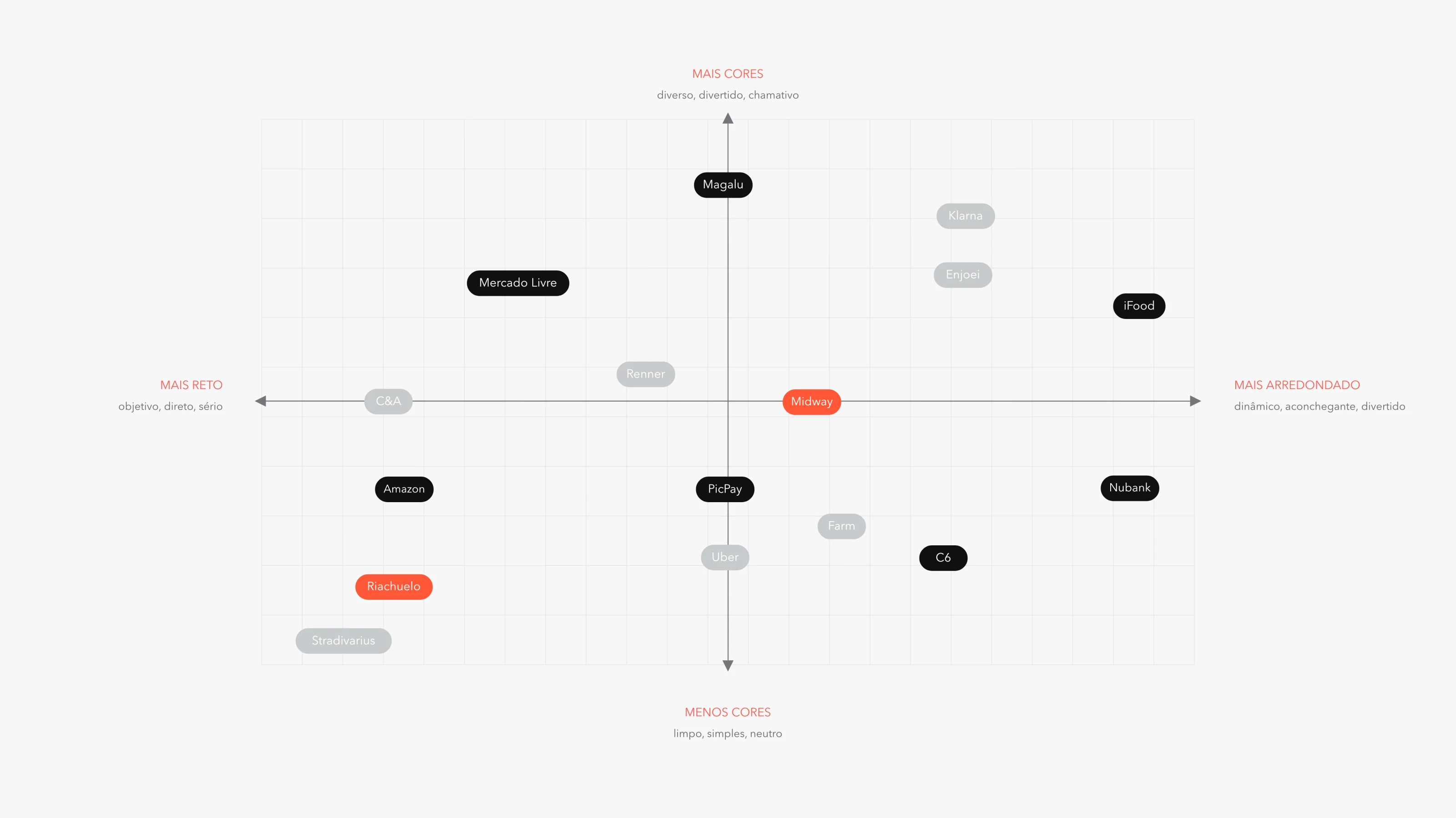
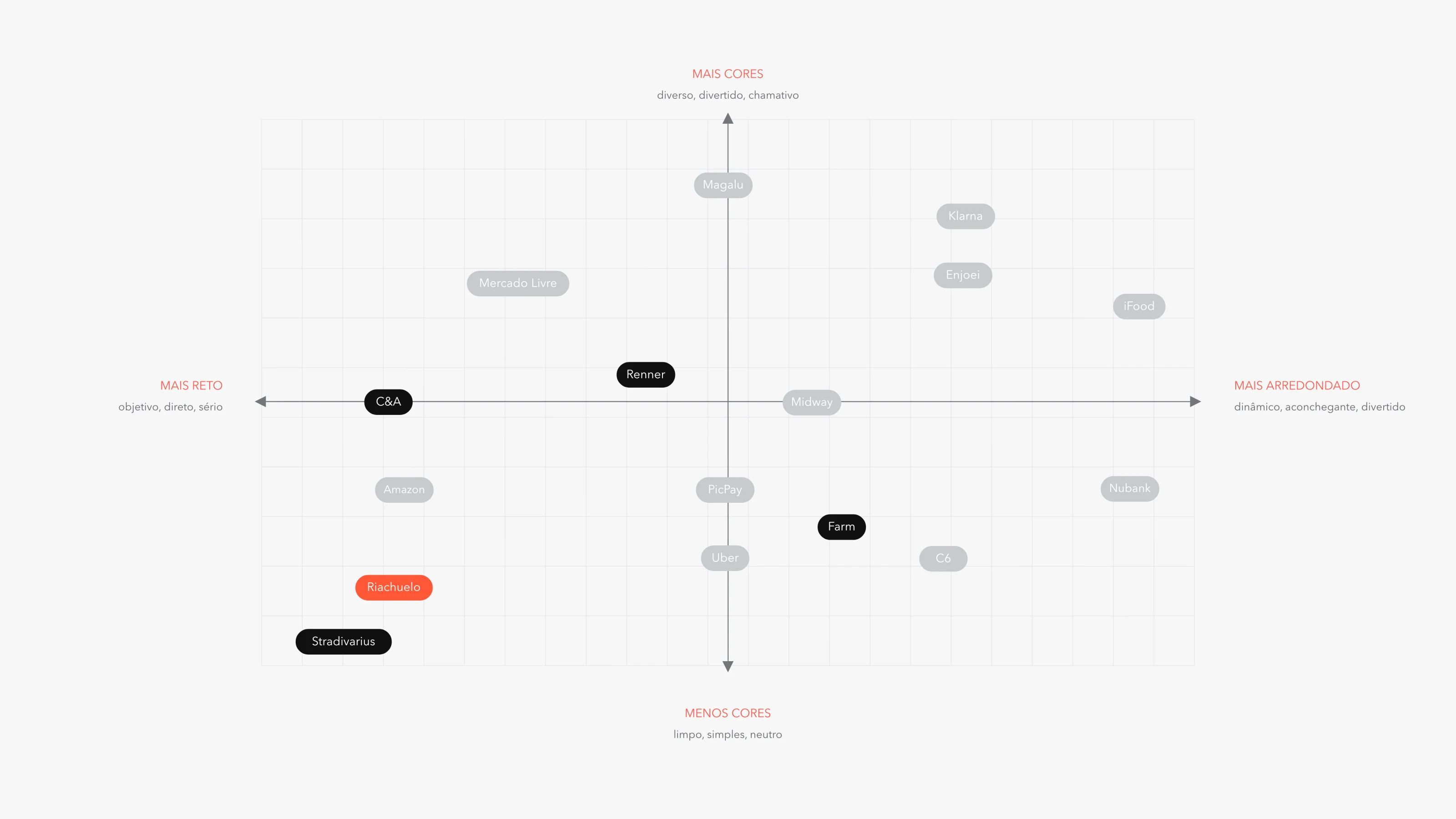
Positioning became a system decision.
A 16-brand matrix clarified the open territory. I selected a direction combining the expressiveness of the Innovative route with the clarity of the Alternative route.
Motion language
Feedback you can feel.
Motion became an affordance: signaling actions, confirming responses and guiding attention across a diverse audience.
04 / System anatomy
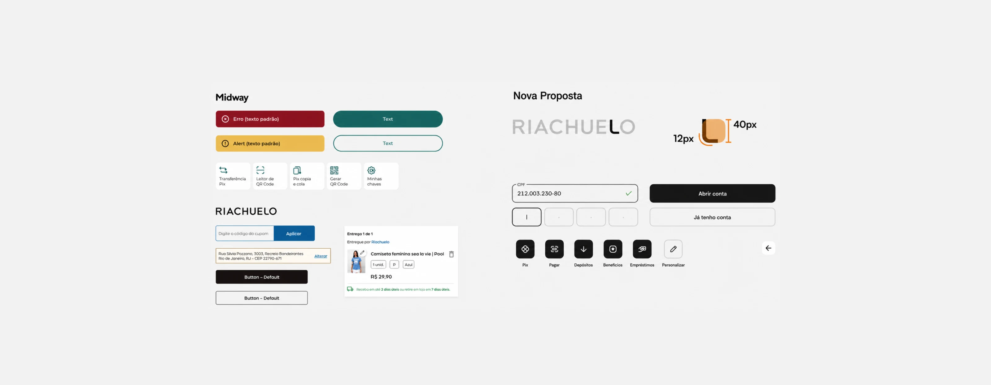
From system rules to production libraries.
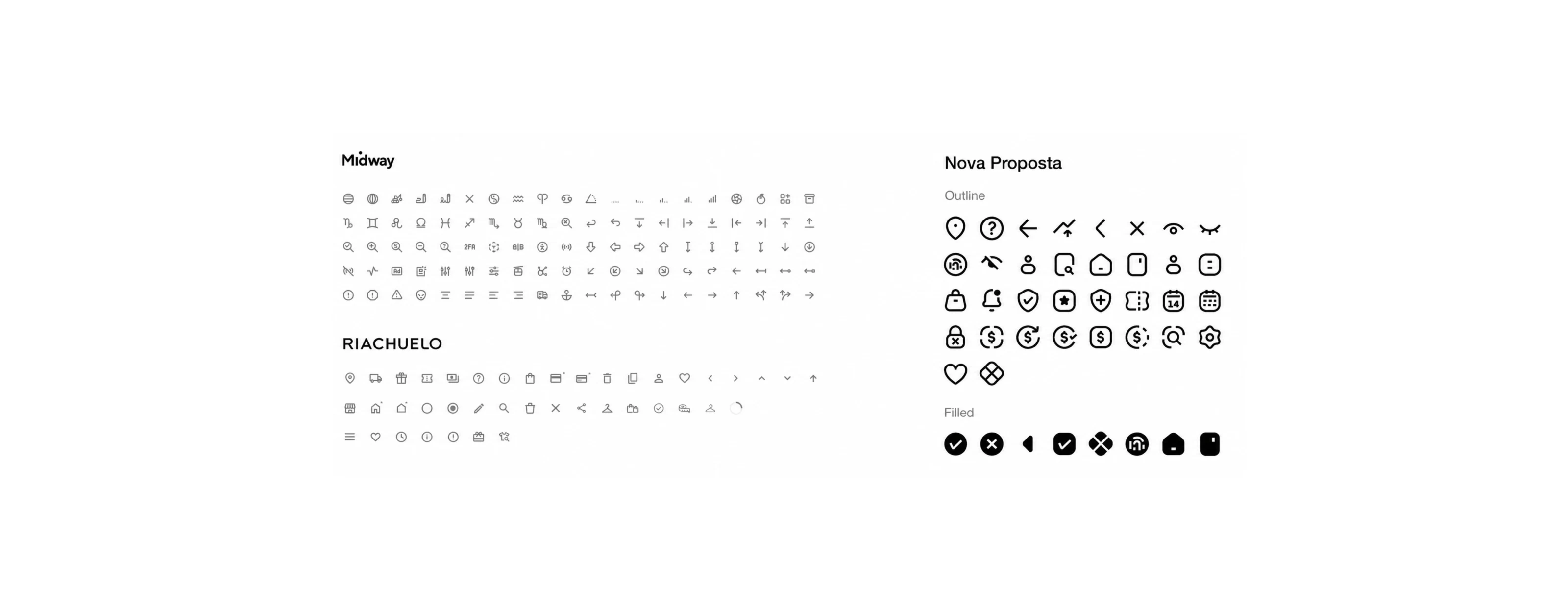
The architecture scaled across components, icons, logos and illustrations for Midway, Riachuelo and E-commerce.
The initial inventory defined 98 essential components for the sourcing scope. The production library ultimately delivered 135 components.
- 135components
- 521icons
- 11illustrations
05 / Governance
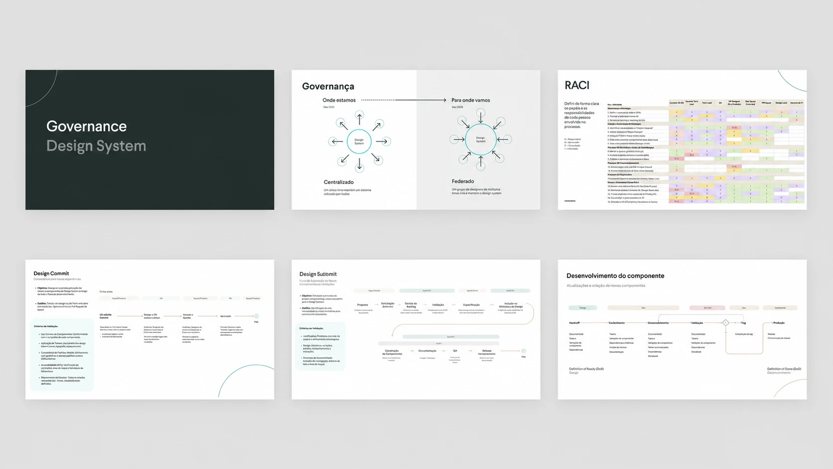
A living product needs decision rights.
Adoption depended on governance, not only a finished Figma library.
I implemented a hybrid centralized and federated model. A core designer protected submissions, technical quality and component integration while squad designers contributed through shared standards. Usage guidance, versioning, changelogs and implementation constraints lived with the governed library.
- Roadmap ownership and RACI.
- Contribution standards and adoption tracking.
- Mandatory versioning and controlled snowflakes.
- Formal deprecation of the legacy library.
06 / Design to code
Connect the system to delivery.
I introduced the group’s first design-to-code workflow, connecting governed components to frontend delivery while preserving the system’s acceptance criteria.
Validation
Test the system in a real journey.
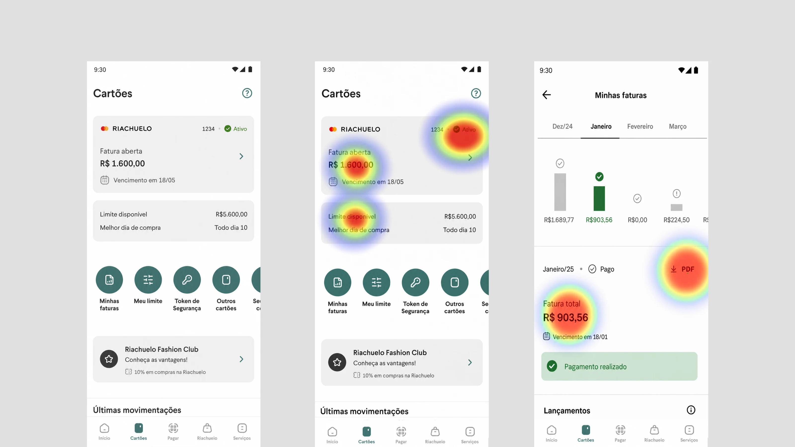
Cards Home became the first full journey built on the new system at one of Midway and Riachuelo’s highest-traffic entry points.
tasks reached 100% success.
tasks ended in complete failure.
to access an invoice.
overall CSAT.
Payment completion took 3 seconds, and heatmaps showed where attention concentrated across invoice access and payment.
Participant count was not documented in the retained case source, so no sample size is claimed here.
Final expressions
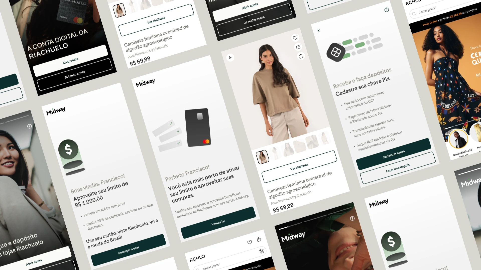
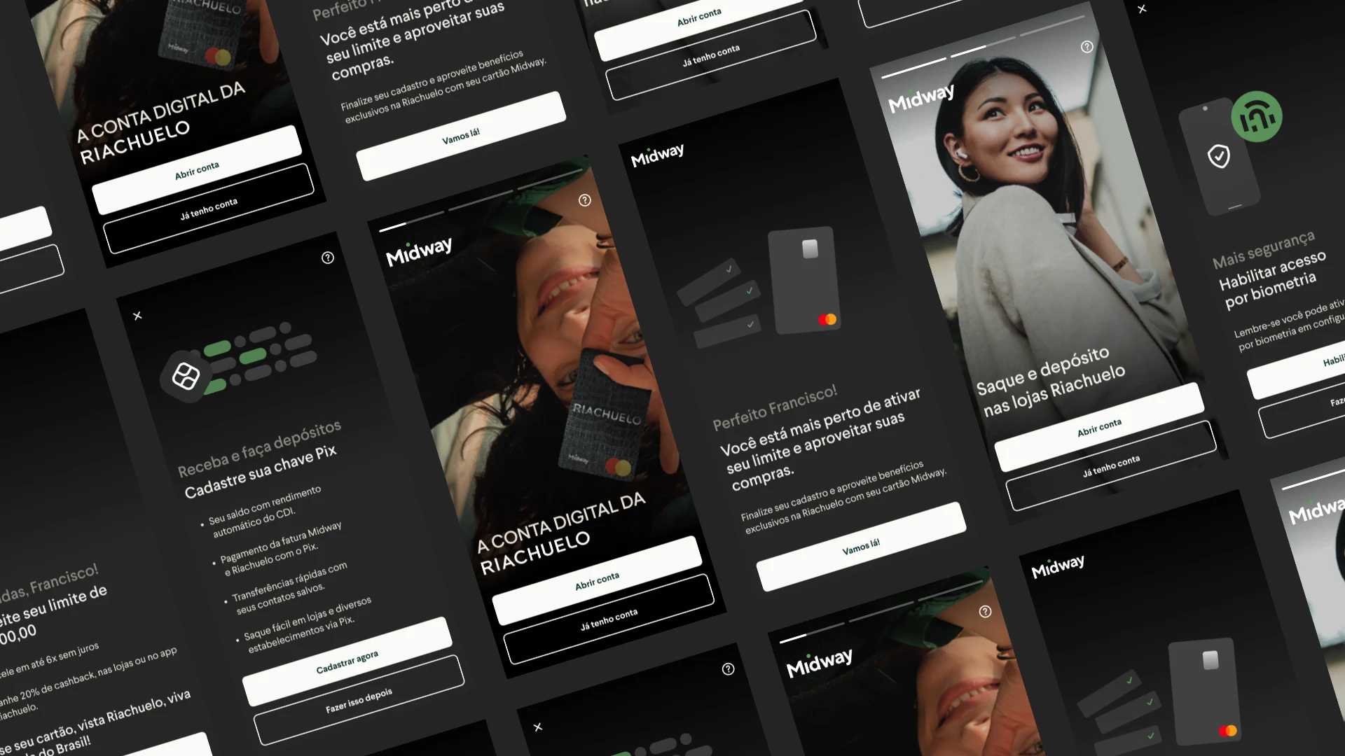
A system that could change context without losing itself.
Leadership beyond the system
The design system supported broader outcomes.
- +59%credit-card upsell conversion · +33% card spend
- −50%cancellation contacts · −14% service cost via AHT
- #2Best Onboarding · idwall 2024
Broader portfolio outcomes shown as leadership context, not attributed to the design system.
Next case
BV: Onboarding View ↘